I've been doing some bits and pieces for Football Focus over the last few weeks. These are mainly designs for the plasma screens on set, developed from the branding we did in 2012. I've been trying to find ways of separating the graphic style on Focus from that on Match of the Day 2, especially in terms of how the team badges and player images are used. The revolutionary idea here was to find a way to use the badges without any effects or styling at all. The whole time I have been working at BBC Sport I don't think I have ever done that before.
Showing posts with label projects. Show all posts
1.4.14
27.3.14
21.3.14
Wenger in Numbers
I've been working on a big project for the multimedia team this week. The final animation is on the BBC Sport site here: http://www.bbc.co.uk/sport/0/football/26673882
24.2.14
Sochi 2014
Here is some of the work that I was involved in for the Winter Olympics.
Winter Olympics Guides
Graphics for guides to the games. Produced by Michael Burke
Sochi Maps
I raided my maps collection and found these old soviet maps, published around about 1960. Some of them feature Sochi as it was then, and were used as reference for a piece by Sarah Cook. Original maps, artwork and final designs below.
19.12.13
Match of the Day 2
Fun with Baskerville for Match of the Day 2. Broadcast on Sunday 8th December.
Some time after making this work I read this post on Design Observer, which officially declares Baskerville as the typeface of truth.
11.11.13
4.11.13
24.9.13
Athletics: World Championships
Graphics for the World Championships in Moscow that was on air between the 10th and 18th August.
The idea started as a play on the idea of the fairytale. Stories of heroism, defeat, victory and struggles, once upon a times and happily ever afters. For ages I've wanted to do something with Vladimir Propp's ideas about the basic components that make up any fairytale. A series of moving illustrations of the different functions or scenes using a cast of common props, characters and motifs to create something that has the feeling of a story, even without a decided narrative.
The visuals developed to become much simpler, images of athletes in Russian settings. Modern figures in mythical style poses, the athlete as hero, warrior etc.
The visual styling was a reference to Soviet children's books from the 1920's and 30's, and some of the classic communist posters. The text and wipes were taken from El Lissitsky's children's book About 2 Squares, although I didn't actually read the story until the end of the project.
The whole package included stings, wipes, captions, stings. And a Russian Bear.
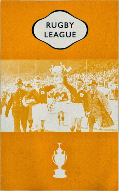
Rugby League Titles
This post was written in May 2013
I spent two weeks last month working on new titles for the rugby league, initially for the Challenge Cup that's on air at the moment.
The idea came from a Paul Bush film using archive footage to tell the story of rugby on the BBC. I had been thinking a lot about the graphical language of rugby after working on the autumn internationals last year. And about how it may be possible to push the ideas forward visually in a way that feels comfortable for the audience (who after some research proved to be much older than expected). The idea of using cigarette cards is something I've been thinking about since visiting the Wolves museum earlier in the year.
The project was made with Mark Woodward, from such hits as Le Crunch and the Match of the Day 2 boxing posters. Below are some of the visuals, from the pitch and development work as well as the final piece. Once I get a copy of the final titles I'll upload the movie onto Vimeo.
Photo from the Wolves museum
Subscribe to:
Posts (Atom)


.jpg)
.jpg)
.jpg)

.jpg)
.jpg)
.jpg)